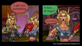
 Today, I grace you with the kickassness of the comic I've been working on for the World of Warcraft comic contest. It's already been submitted and I hope for the best. Although I have plan B if this one should fail, I think this comic is the better one. I came up with the idea two days ago and work for a full day on it. Very rarely do I do things in full color, use screenshots, and top it off with complete shading (highlight, shadow, and coreshadow), but this was a special occasion. It turned out very nice, one of the better exmple of my illustration muscle flexing. Beefcake!
It has been bit since my last post, but I have a perfectly good excuse. I've been a bit under the weather lately. Today, I suffered through a stomache that left me fatigued, that being a recurring theme these past few days. I still have my online class to catch up on.
Line quality is my point of discussion today. Line quality is key in conveying depth, level of detail, and even lighting in a drawing. A vaired line quality can do much for a drawing and how effectively you can pull the elements from the page. In the shadow, lines are thicker and in the light they are thinner. Also, as I've discussed before things that are farther and more detailed deserve a thinner line.
1 comment:
Saw the comic at the WoW homepage, great work!
Post a Comment